E-commence A/B Testing
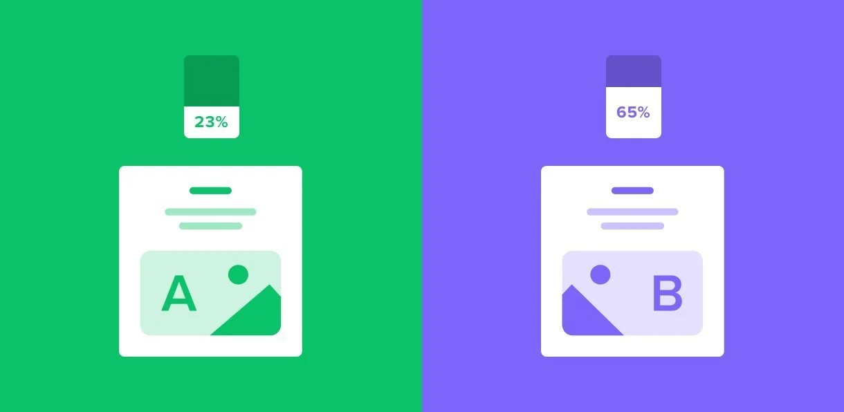
A/B testing, also known as split testing, refers to a randomized experimentation process where two or more versions of a variable (web page, page element, etc.) are shown to different segments of website visitors at the same time to determine which version leaves the maximum impact and drive business metrics.
As the main UX resource for one of Estée Lauder Companies’ key brand - MAC Cosmetics, I am responsible to write and launch A/B tests. I identify variables and hypotheses of A/B tests; design test variant(s); submit A/B test tickets; and work with an assembly team to update designs based on test results for Site Optimizing the site. I ran A/B tests, and a sample for one of my test results is an annual revenue increase of $340,000 for brand.com.
To comply with my non-disclosure agreement, I have obfuscated confidential information in this case study. The information in this case study is my own and does not necessarily reflect the views of ELC online.
One of A/B test examples
Multiple Product Page Site Optimization A/B Test
The Issue
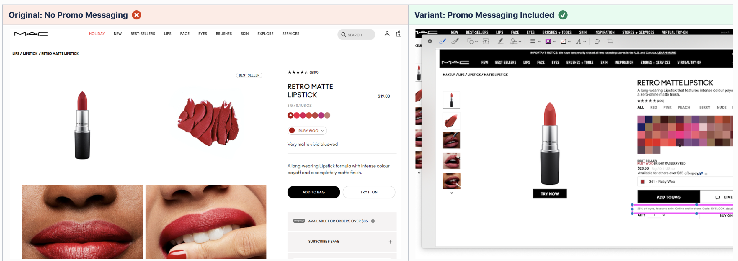
Maccosmetics.com launched the new multiple product page on 9/30/2021. We have seen KPIs decline on MPP on the US site after more than 2 months:
Page views has seen a +11% increase
Avg. Time on page was decreased by -9%
Bounce rate was up +7%
Add to bag button engagement rate saw a decline of -3%
Filter & Sort on engagement rate was reduced by -6%.
New Users saw +1% uplift, and +4% on returning users.
Mobile is the only device type that is seeing a decline, -2% vs. Prior Period. However, Desktop +12% and Tablet +2% are seeing growth in new users.
Hypothesis & A/B Test
Our hypothesis is, “If we update the multiple product page design by changing the position of certain elements, then the performance of multiple product page can be improved and the overall revenue will increase.” We wanted to conduct a A/B test to validate our assumption. For B test, we wanted to see the changes below:
Removed the top banner image on desktop and mobile
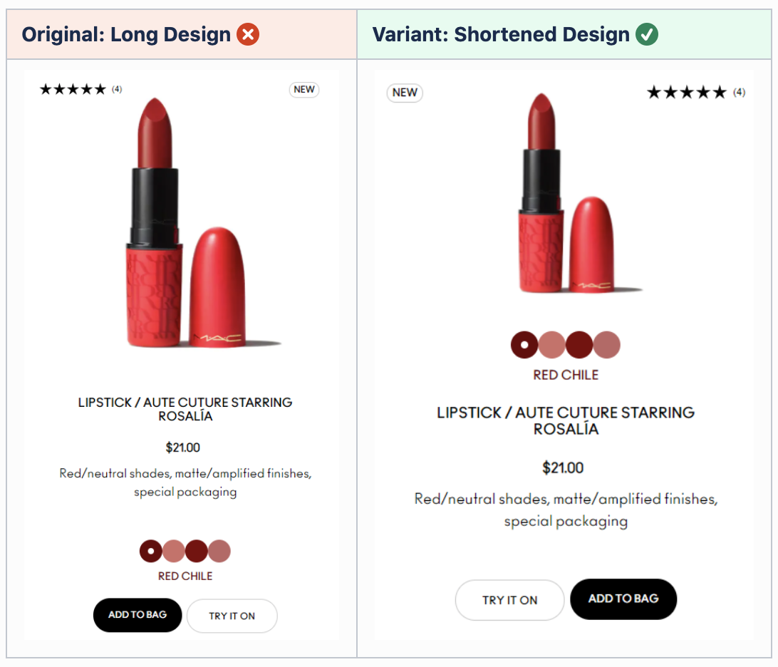
Center the title, paragraph, and SEO; decrease the size of the title to 34px on desktop and 24px on mobile
Decreased the height of product card
Decreased white space
Decreased ⅓ of the product image size both on desktop and mobile
Moved swatches above product name and under product image
Decreased 4px of the shade pickers on mobile
Changed to SD filters
Switched add to bag & try It on position on MPP
Switched best seller & stars position
Variable(s) with Split: 50% / 50%
Audience: US users both on desktop and mobile
Primary Metric: Conversion Rate
Secondary Metric(s):
Page Views
Product Clicks
Scroll rate
Bounce Rate
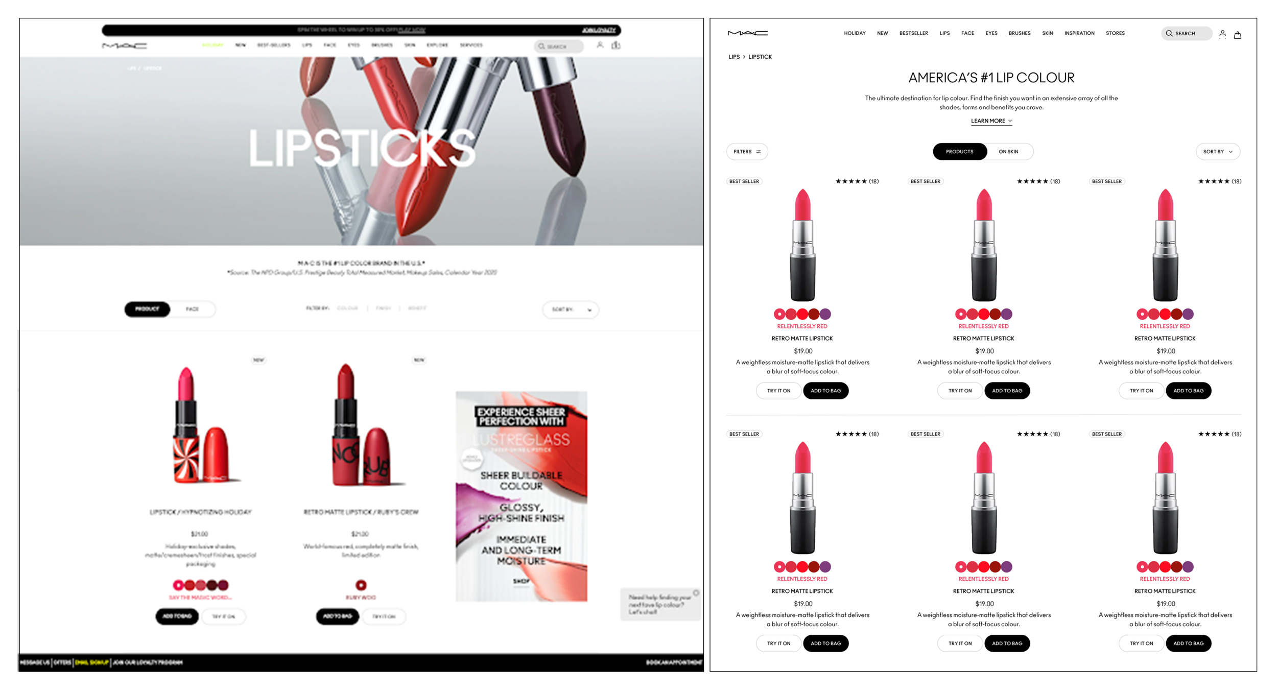
Test A (left) VS Test B (right)
The Results
We used Google Optimize to run the test . After 40 days, our analysis team presented an update of the result below:
Desktop users significantly and positively impacted by the shortened design
Mobile users were positively effected
Holiday peak caused variant to strongly outperform original
Potential revenue increased around $150,000 annually
Recommendation and Next Steps
The desktop showed a strong positive result but It is interesting how mobile users are responding slightly positive when the layout is so closely similar on both desktop and mobile. We feel there is a change that mobile users are not responding well to. We decided the run a multi-variants test for mobile only and the test is still running at this moment.