E-commerce Skincare Product Page Template
As a global UX team in Estée Lauder Companies, creating and updating white label designs across 20+ brands is one of our key responsibilities. We work in a highly iterative format, tailor-made for our agile teams based on learnings from real users, research institute, quantitative and qualitative data.
Single product page is one of the key pages on e-commerce site. It can be difficult to get right. It’s typically a ‘template’ reused for every single product on the site. On top of this, it’s often on the product page where users make up their mind on purchasing the item or not. We’ve observed that even small UX issues in a site’s product page implementation will often cause direct site abandonments. Complicated SPP tends to overwhelm and forces longer decision making for users.

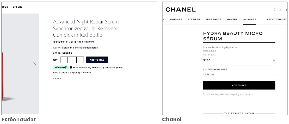
Estée Lauder’s single product page
My Role
I have been a lead designer responsible for collecting data, research findings for the single product page; updating the white labeled single product page based on the insights; sharing the newest single product page learnings with brand teams when they are looking to update the page.
To comply with my non-disclosure agreement, I have obfuscated confidential information in this case study. The information in this case study is my own and does not necessarily reflect the views of ELC online.
Research and Key Findings
I have been researching Estée Lauder Companies brands and competitors’ single product page, summarized research from single product page insights from our research partner - Baymard Institute. I collected analysis data from A/B tests and user testing to understand what elements and experience could make a single product page an enjoyable experience, and easy to shop for consumers.
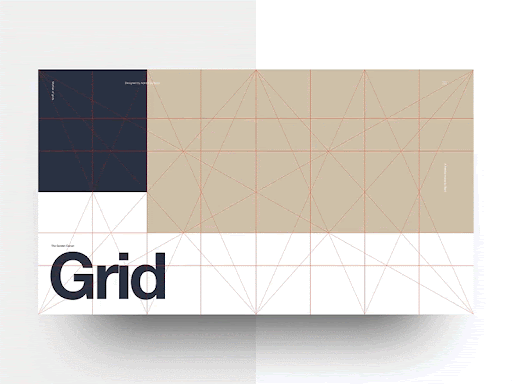
I observed that single product page can be assembled by 4 parts: product details section, product content section, cross selling section, and reviews.
Product Details Section
The product details section on single product page displays product name, price, key product benefit, alt images, quantity and add the bag CTA. Each element plays a key function when customers land on the page.
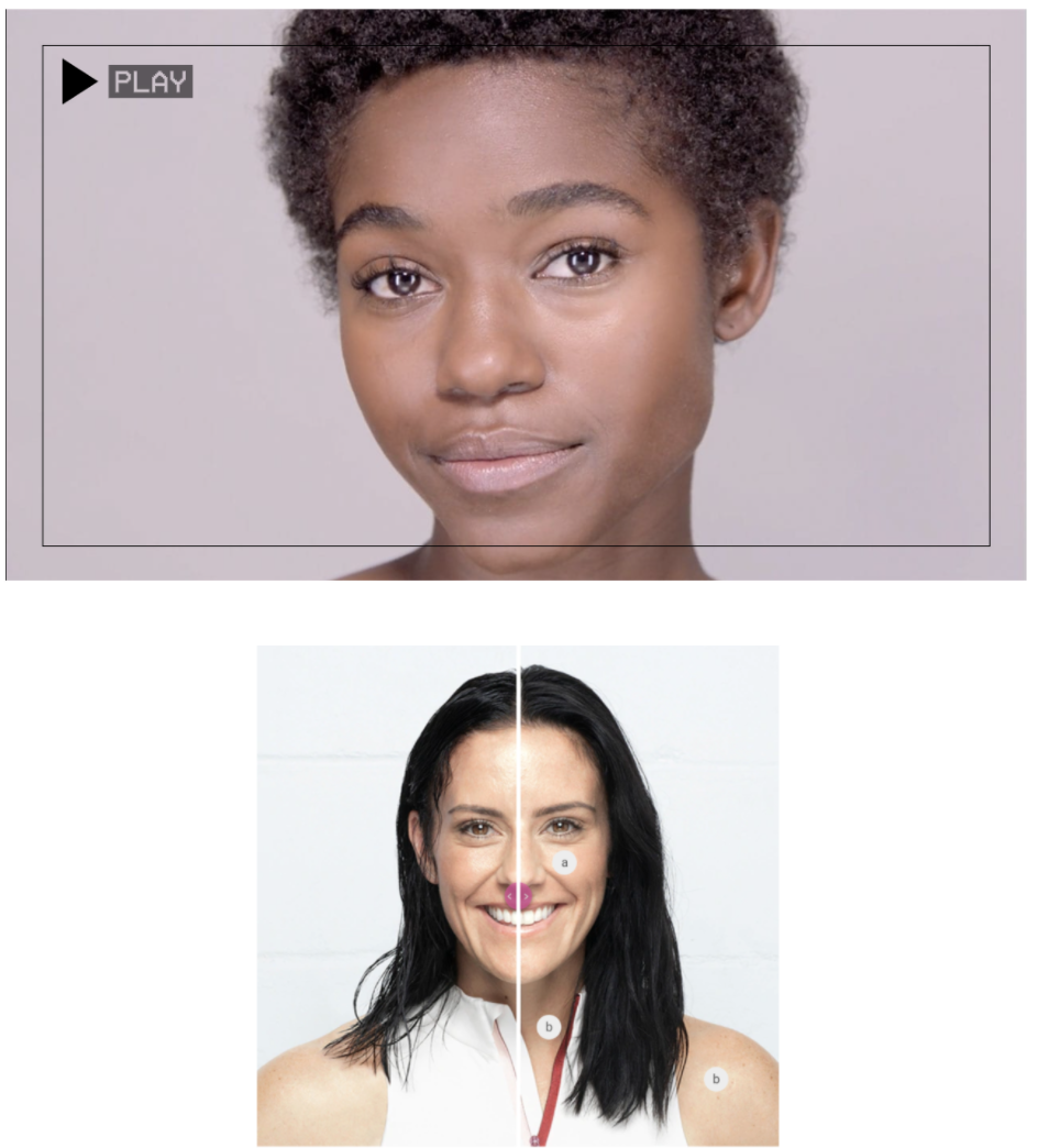
Alt images
Alt images are important on SPP. 31% of users used the default shown image to make a quick judgement of whether a product would meet their needs or not and 56% of users’ first actions were to begin to explore the product images.
For visually-driven products, consider having large default images on the product page, since the large size will better support users in their desire to perform a detailed visual product inspection.
we have been testing 2 Alt image layouts(One Image Grid VS Multi Image Grid) on SPP.
(1) We found out the best practice example for alt images:
Users prefer product image tiles to select from & visitor able to toggle left/right on main image to see different images.
Page feels less cluttered as one focus image is displayed at a time.

(2) We also found these 5 types of images with providing "Feature Callout" for products help to build a strong product case for skincare products:
Product Image
Scientific Proof /Benefits
Product Texture
Steps
Product Routine
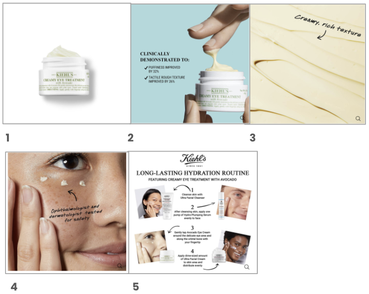
Contextual Content
Have easily digestible and not overwhelming content.
Highlight Key Product Features in the Product Headline
Style product price to be highly visible
Consider including some of the product description above the fold
Use individual “Buttons” for each size variation
Ensure the primary ‘Add to Cart’ button’s styling is unique and prominent
Place ‘Free Shipping’ information near the ‘Buy’ section
Allow users to purchase “Out of Stock” products by increasing the delivery time
Include “Find in Store” information near the “Buy” section
How to implement ‘Save’ features
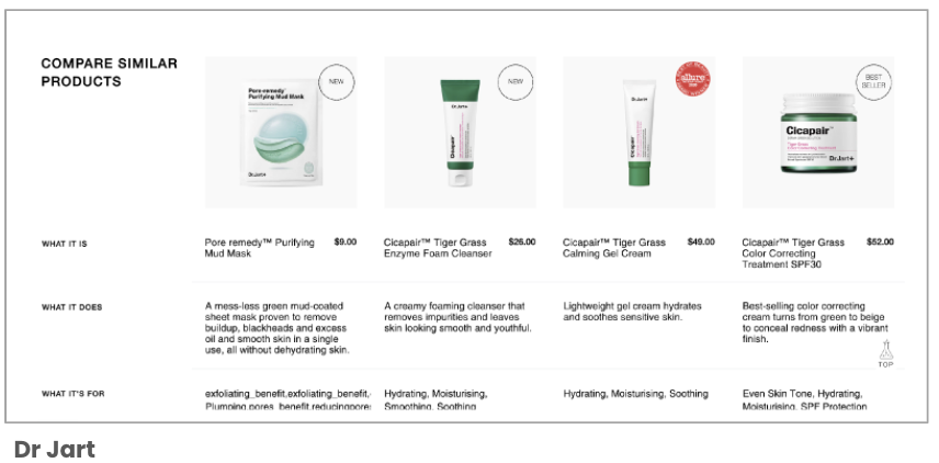
Product Content Section
Product Content
Don’t use horizontal tabs as the product detail page layout; Vertically collapsed sections
Use both “bullet lists” and “blocks of text” for product descriptions
Use accurate and specific section titles for product content
When featuring “Expert” content, provide the “Expert’s” title or qualifications alongside relevant content


Product Content examples
Available Templates: Trend Module and Basic Tout
The Trend module supports product on model display along with “How-to “ steps for application and shoppable product
The Basic Tout in a grid layout may be used for a simplified “How-To” of product usage. Supporting live text with static and/or MP4 animation display

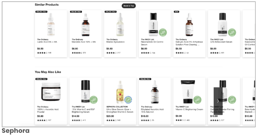
Cross Selling Section
Cross Sell
Provide alternative cross-sells
Overall, brands tend to have 1-3 cross selling product modules.
Reducing the number of cross selling sections will reduce clutter and length of page
Reviews Section
Reviews
Provide a graphical ratings distribution summary at the top of the review section
Most Rating and Reviews have options to filter, search, or sort reviews giving users ability to find their unique information without endless scrolling
Highlighted reviews on top, filtered options for reviews
Reducing the amount of reviews by providing expanding options

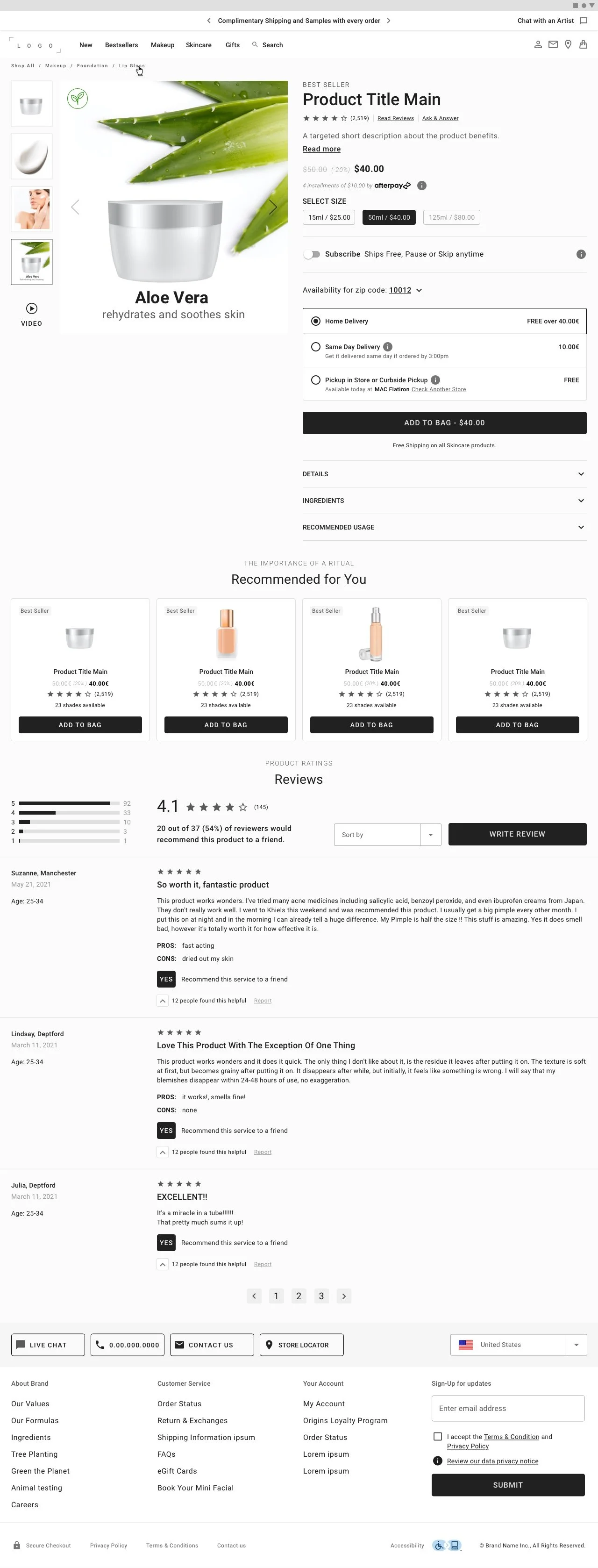
SPP Template Design
SKINCARE SPP (FULL)
The Single Product Page will have an adaptive modular approach to fit all product needs as well as our user’s need of product education and details.
The design is a detailed version which includes 4 parts: product details section, product content section, cross selling section, and reviews.
SKINCARE SPP (COMPACT)
We also has this compact version. We simplify some parts to match some of the needs and use cases.